
CHOOSING A STUDIO PORTRAIT BACKGROUND
THE IMPORTANCE & CREATION OF YOUR BACKGROUND
If you are booking a studio portrait session, there are a number of options regarding the background you are shot against, and, in turn, the lighting of both the background and the subject (person to be photographed). Here I'll go over the main variables you can choose from and the advantages (and potential limitations) of each.
Whether you're a business considering my on location studio portrait service or a group of private individuals wishing to get headshots in my Paris studio, it's essential the studio background be decided upon well in advance of the shoot, so that on the day the correct equipment is prepared and installed.
As standard, I provide classic seamless (i.e. non-textured) neutrally coloured backgrounds:
White
Grey
Black
With lighting, I can then achieve:
Any desired gradients (tone variations, halo effects, spots etc)
Any desired non-neutral colour (blue, yellow, orange etc)
In post-production, I can then achieve:
Any desired textural effect (creases, ripples etc)
FACTORS INFLUENCING YOUR BACKGROUND CHOICE
The most appropriate background for your needs may depend on:
The clothing of the subject to be photographed, e.g:
Dark clothing will stand out better on a lighter background and vice versa
Your post-production needs, e.g:
superimposing, masking, "cutting out" subjects etc.
The importance of maintaining consistency between shots or even between past and future shoots:
The more specific and complicated the background (and accompanying lighting), the more difficult it will be to "recreate" on future occasions.
This is an extremely important consideration for global companies who wish to maintain consistency between portraits taken in different locations and by different photographers, and is the main reason many organisations develop global style guides for their photography.
Time and budget: generally the more complicated a light setup
the longer the installation and testing time
the more materials will have to be provided by the photographer
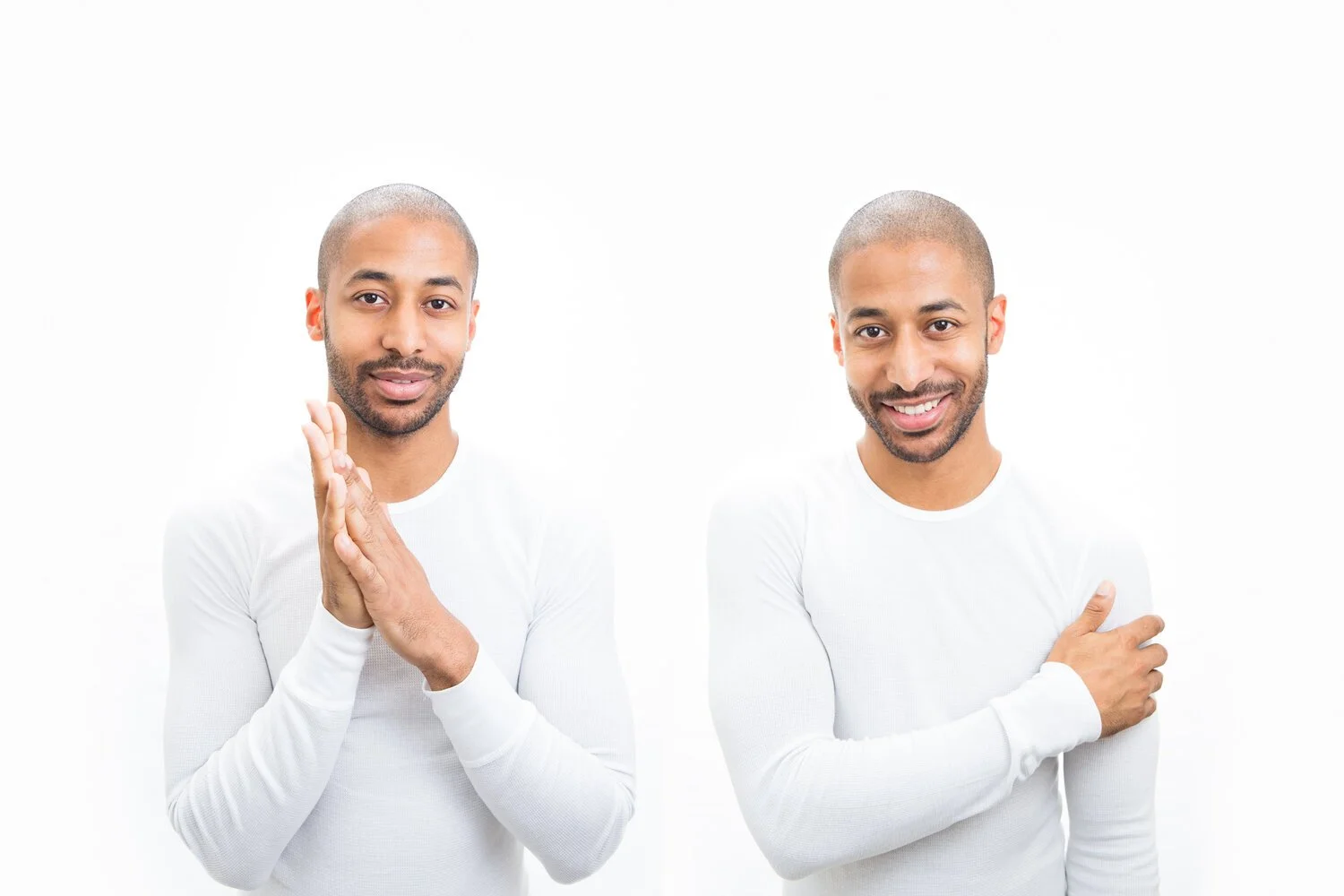
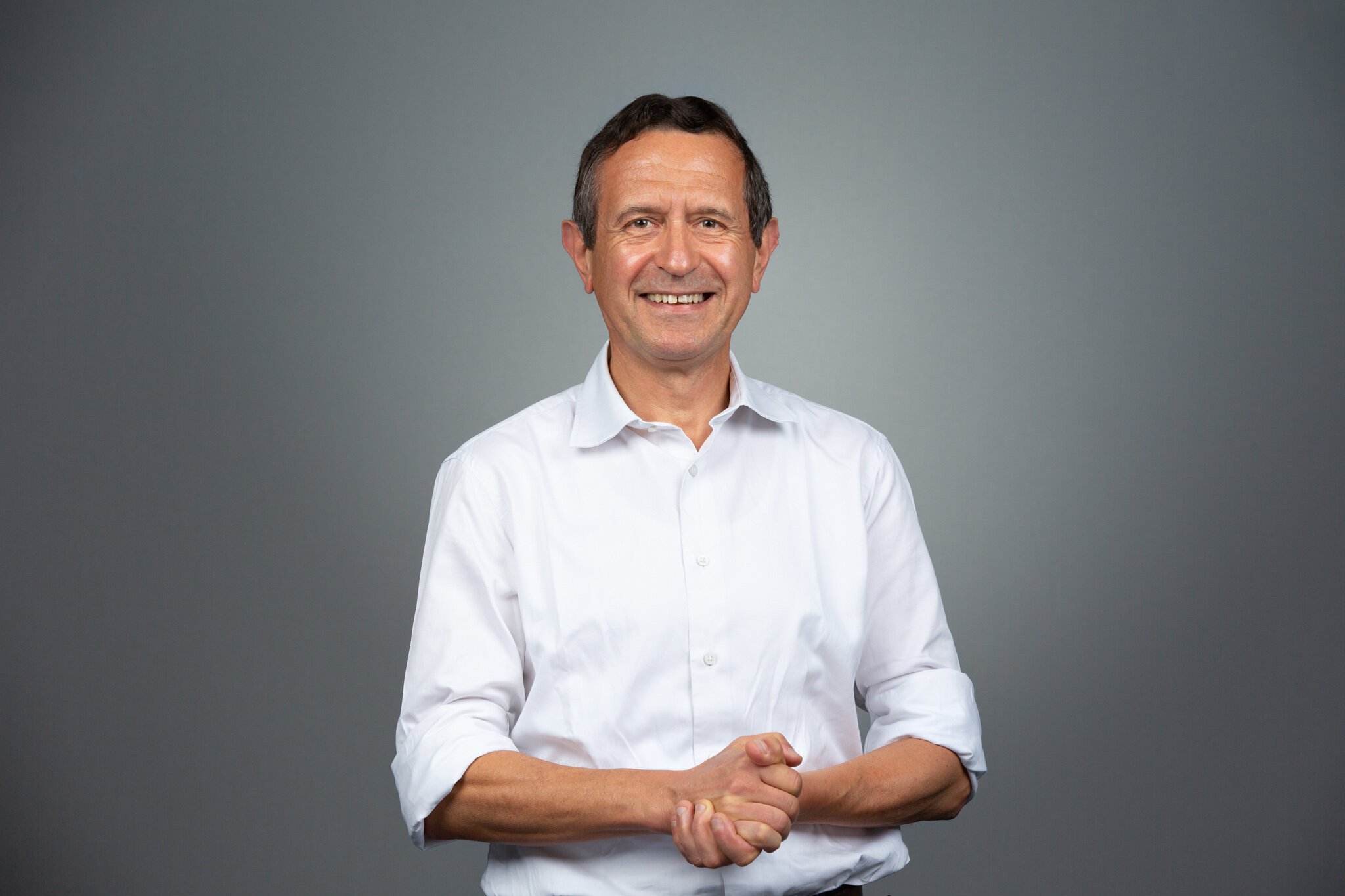
PURE WHITE

Why would you choose this option?
It is a set colour with a definite colour value (#ffffff), which ensures:
Absolute consistency across all images - if you wish to shoot on anything other than pure white (or pure black), they're will always be tonal fluctuations between shots and, inevitably, some level of gradient (which might not be desired).
Predictability (you will always know exactly what you're getting) = minimal amount of Art-Direction = minimal amount of tests (which also saves time).
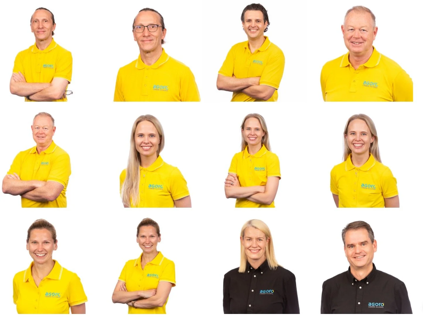
Therefore, I fully recommend this option if you:
Have multiple people to photograph on different occasions and by different photographers and want the maximum level of consistency possible.
Wish to display various portraits together in a grid, in a carousel or in a slideshow; the transition will be seamless as the background will never change. Visually this is very harmonious and is fantastic for representing teams of people.
Wish to shoot on premises, in a shared space where you have no control of lighting.
Have limited time and want the quickest, most efficient studio portraits possible.
The post-production flexibility it will offer you for potential graphic design needs in the future (superimposing, masking, "cutting out" subjects etc). Pure white is ideal for this.
Pure white gives a generally high-level of contrast against the average subject, i.e. the majority of skin tones and clothing colours.
It gives the cleanest, most pristine look to the subject.
Of the neutral colours (white, grey, black), it most effectively:
emphasises colours worn by the subject.
conveys "positivity" and energy.
Being so generic, it places great emphasis on the subject.
Being the "brightest" option with the least amount of contrast, all aspects of the subject will be exposed (no element will be hidden in shadow). Great therefore or placing emphasis on a team uniform or intricate clothing for which of which you want the entirety to be clearly displayed.
Why wouldn’t you choose this option?
Pure white is admittedly the most generic background possible. Some might see it therefore as
too basic and not unique enough.
too strongly linked to e-commerce, stock images, or even passport photos
You with to photograph people in white or light coloured clothing against which a white background may provide too little contrast.
The lower level of contrast may make black and white versions less impactful than is achieved with other background options.
My professional opinion…
Should you be concerned about the generic nature of white backgrounds, I can only draw your attention to the multiple advantages of pure white and remind you that there is a good reason that this is the most popular background colour: Pure white it is by far the best all-round and surest option.
GREY WITH "HALO" GRADIENT
Why would you choose this option?
Being a mid-tone, it's a great compromise for shoots involving multiple subjects wearing various tones of clothing.
Absolute consistency across images is not important; you prefer individual portraits that "speak for themselves”.
The "Halo"
draws the viewer's eye to the subject.
gives a much more refined look than a standard seamless background, whilst maintaining a style that can quite easily be replicated on other occasions.
In my experience, this option tends to work the best when converting the images to black and white; if your black and white versions (which I provide with each portrait service) are equally or more important to you than the colour versions, that is a very good reason to consider this option.
Why wouldn’t you choose this option?
Your subjects' clothing is also "mid-tone" and would therefore provide too little contrast. This is often the case where subjects wearing grey suits risk getting “lost” in the background.
You have future post-production requirements (superimposing, masking, "cutting out" subjects etc), for which a seamless (non-gradient) background would be far more appropriate.
You wish to display various portraits together and therefore require absolute consistency between images (gradients are non-defined colours).
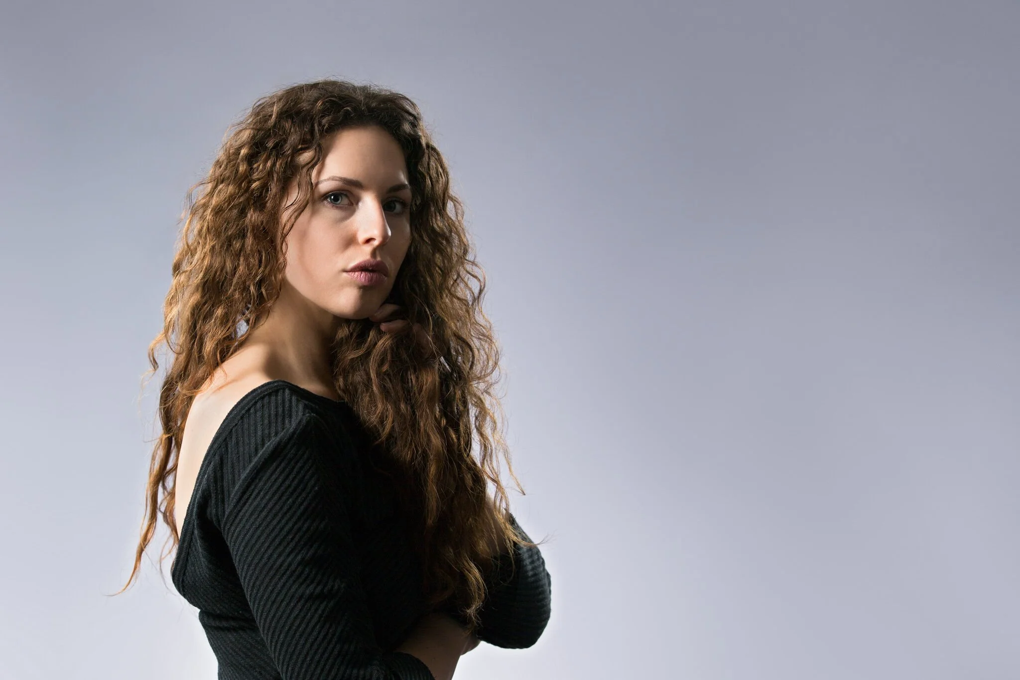
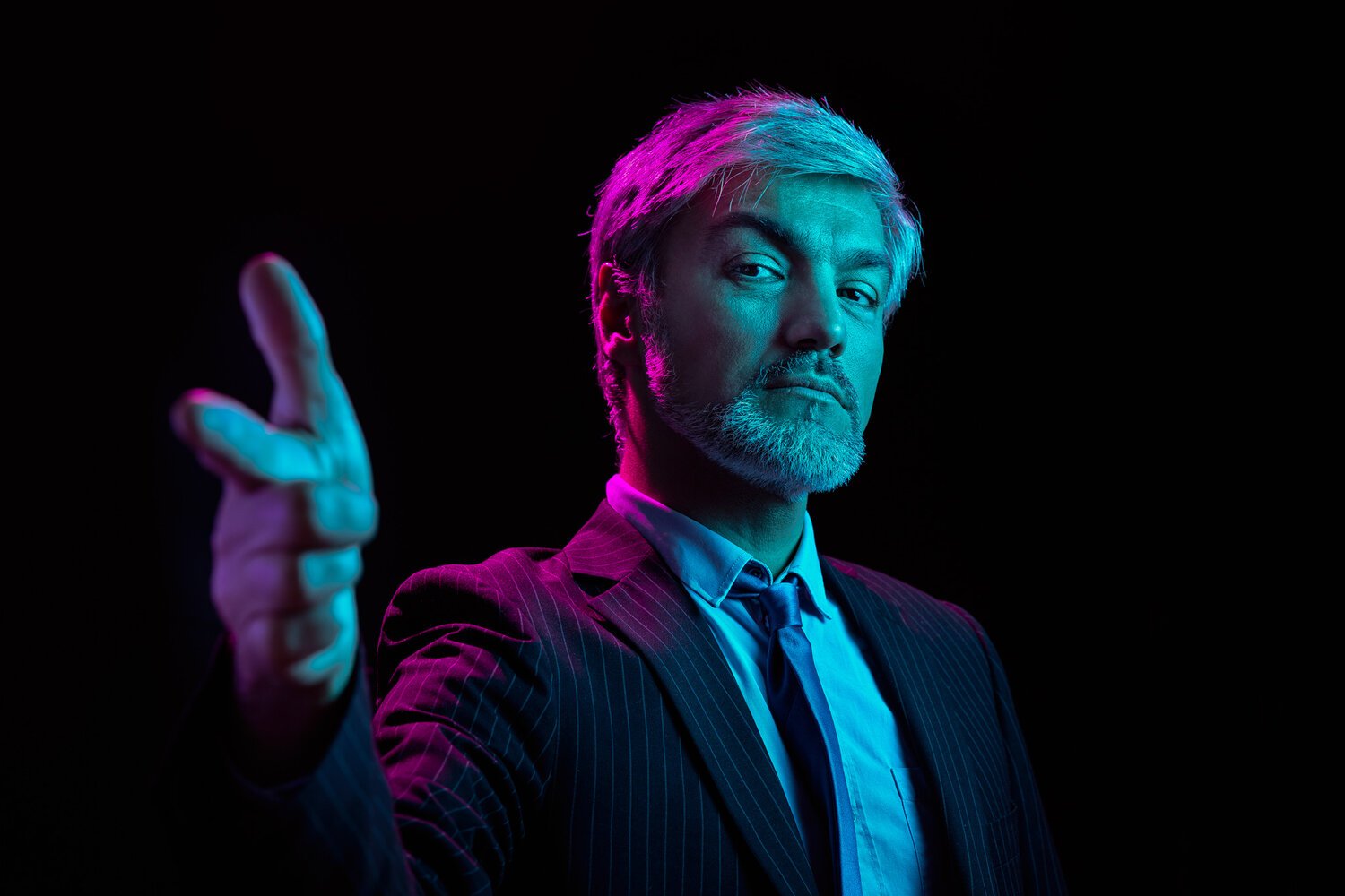
PURE BLACK or BLACK WITH "HALO" GRADIENT
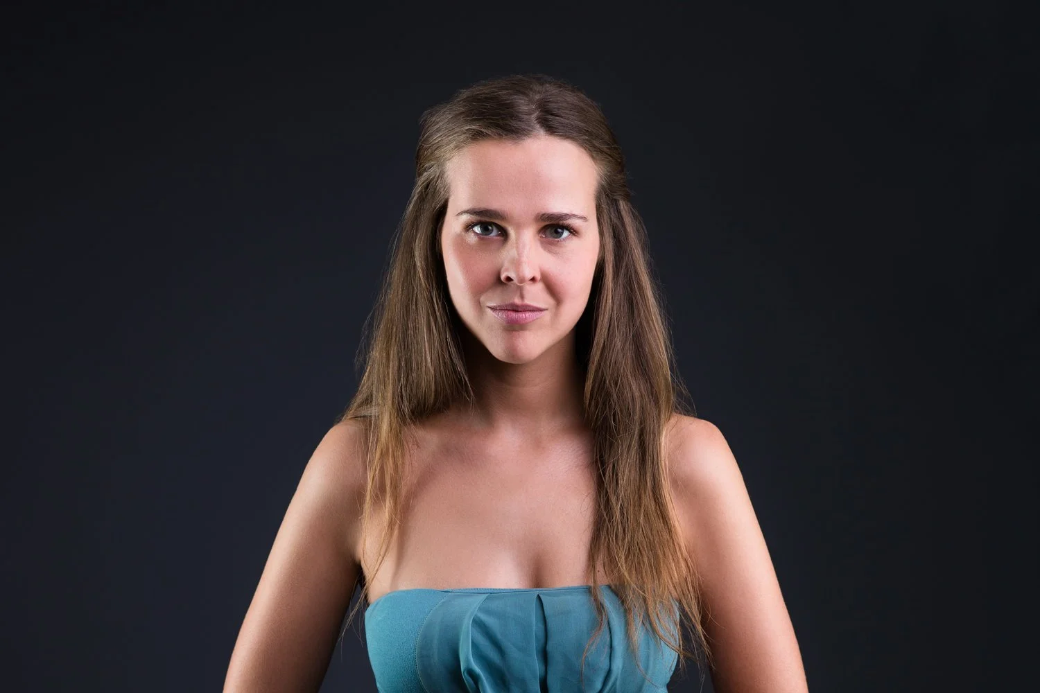
Why would you choose this option?
You want a high-contrast, dramatic effect whose shadows emphasises the facial features of the subject. For this reason this approach is perfect for
promotional imagery for performance artists, such as actors, models and musicians.
corporate imagery which places a real emphasis on the subject's expression.
(this can create a highly personable effect, for example).
Why wouldn’t you choose this option?
As the subject's outline is often hidden / very undefined, it can be the least usable option for any post-production requirements you might have in the future.
The darkness of the image might render it less flexible for standard usage (lighter backgrounds will tend to work better in the majority of online environments for example.
NON-NEUTRAL COLOURS
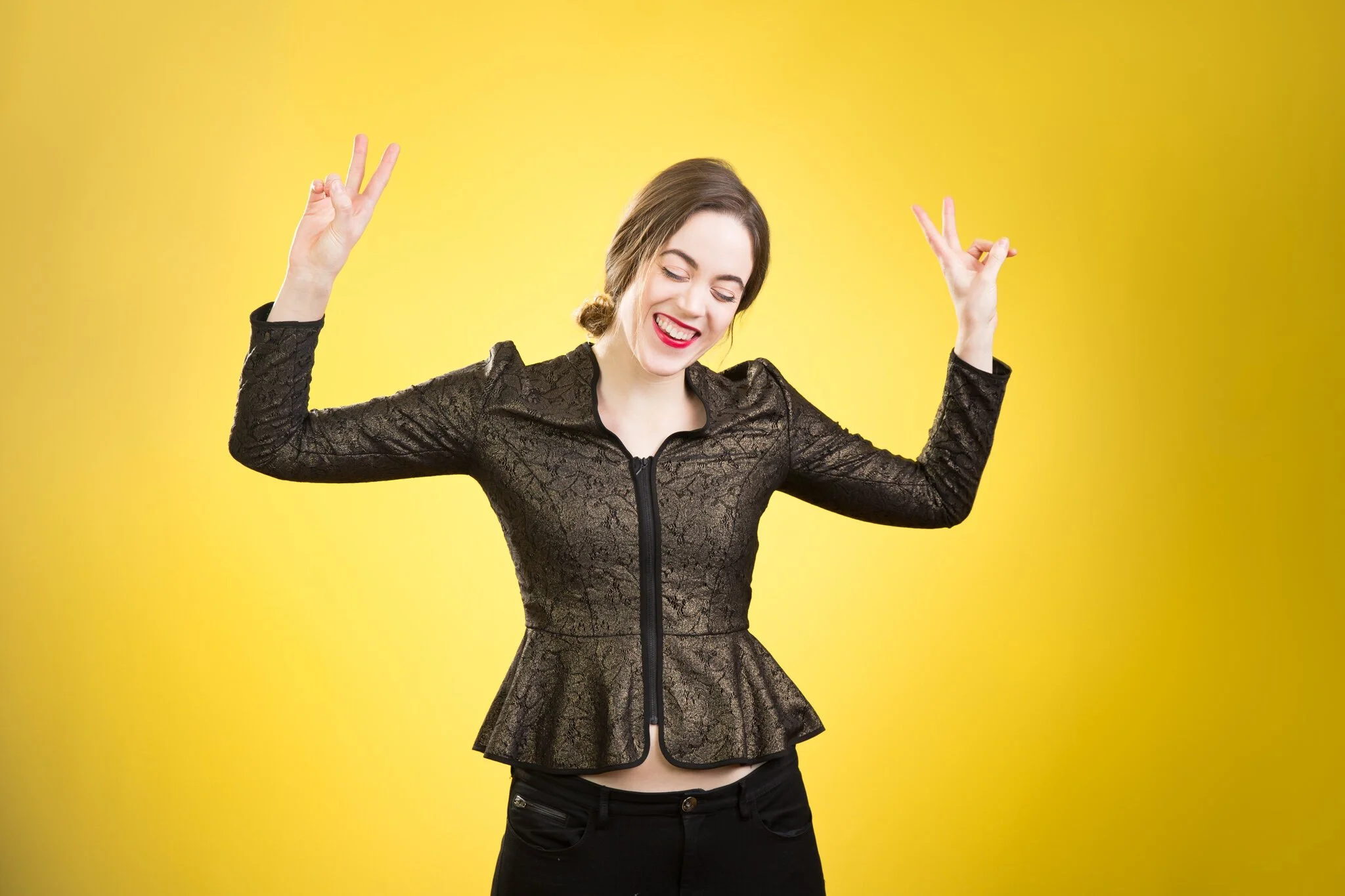
Why would you choose this option?
You want something that renders the whole image as eye-catching, not just the subject.
A type of colour is more appropriate for your brand identity.
You want an overall look that is as unique as possible.
Why wouldn’t you choose this option?
It can be very limiting as a specific colour will often be somewhat inappropriate for standard use. Although colour can be removed in post-production, there is no guarantee that the background that remains is desirable.
You need consistency across multiple shoots by multiple photographers, which is for all practical purposes, impossible when working with "live" colour.
(In this case you would be better asking photographers to shoot on seamless neutral backgrounds and adding colour yourself in post-production)
PURE BLACK WITH COLOURED SUBJECT
Why would you choose this option?
You simply want striking images that show the subject in a very unique way.
This very specific effect appeals to you.
You’re a creative who wants images that have the maximum impact.
Why wouldn’t you choose this option?
This is without a doubt the most limiting effect, as
there is no way to (effectively) remove colours from subjects in post-production.
black-and-white conversions are often hit-and-miss
STILL UNDECIDED?
If you are unsure of the best option for you, simply get in touch, providing as much information as possible about your needs and concerns and I will be very happy to advise you.
contact@brettwalshphotography.com
+33 (0) 6 52 28 23 45